Evolving Design Practices
The evolution of design signifies a fast and ongoing transformation, emphasizing the improvement of user experience, prioritizing health considerations, and the pursuit of aesthetic enhancements in digital interfaces. This ongoing innovation within design practices is not only about the visual appeal but also about creating experiences that prioritize user comfort and overall well-being. From the simplicity and functionality of minimalist design to the introduction of features like dark mode aimed at reducing eye strain, designers are consistently striving to craft interfaces that resonate with users on a deeper level, blending both functionality and aesthetic allure. This blog will explore the evolving design practices, providing insight on the intersection of modern technology, user experience, and visual elegance.
Minimalist Designs
Minimalism has become a trend because it offers simplicity, clarity, and an uncluttered experience, which many people find appealing in a fast-paced digital world. It started gaining prominence in the 20th century through art, design, and architecture movements that emphasized simplicity and functionality.
From home decor to app design, website interfaces, and overall aesthetic preferences, minimalism has emerged as the epitome of luxury. The new digital minimalism design is a popular trend for apps and websites. It focuses on simplicity, removing unnecessary elements, and creating clean, easy-to-use interfaces. This design approach aims to reduce distractions and enhance user experience by presenting only essential features and content.
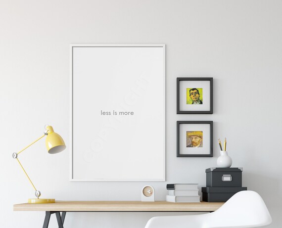
’Less is More’: Minimalist Interface

The concept of ‘less is more’ has become increasingly trendy overtime. It emphasizes the idea that simplicity and minimalism often offer greater impact and appeal than complexity or excess. This approach has permeated various aspects of life, including design, fashion, technology, and lifestyle choices. People are embracing the idea that by focusing on essential elements and decluttering, they can achieve a more refined and effective outcome. ‘Less is more’ has become a guiding principle for those seeking elegance, efficiency, and clarity in a world that can sometimes feel overwhelming with excessive choices and information.
The objective of minimalist web design is to showcase content and features straightforwardly, minimizing distractions from the main content. This approach is often about eliminating elements that don’t align with the primary goals of the interface or its users. While the definition of minimalist design might vary, some widely acknowledged features include flat textures, restrained color schemes, and the incorporation of negative space. The next article in this series will delve into a detailed discussion about these specific characteristics and their prevalence in minimalist websites.
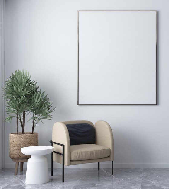
Minimalism in website and app design revolves around simplicity, clarity, and functionality. These designs feature clean interfaces with fewer elements, leveraging ample white space to highlight crucial content and streamline navigation. They adopt a limited color palette for visual harmony and employ straightforward typography for readability. These designs ensure users can easily find what they need without overwhelming options. That’s why minimalism has gained widespread popularity in the modern era—it’s much easier to navigate and understand what’s happening without getting lost.

Functionality takes precedence over unnecessary decoration, with every element serving an actual purpose. By reducing visual clutter—such as unnecessary graphics or animations—minimalist designs enable users to focus on the primary content or task, aiming to create an effortless experience and enjoyable user experience. A minimalist interface embodies simplicity and clarity in its design. Here are details about a minimalist interface:
1. Clean Layout: The layout is uncluttered, with ample white space, allowing elements to breathe and ensuring ease of navigation.
2. Simple Typography: Fonts in a minimalist interface are usually clean, sans-serif typefaces that prioritize readability. They avoid ornate or decorative styles, opting for straightforward, easily readable fonts.
3. Limited Color Palette: A minimalist interface often employs a restrained color scheme, using a few well-chosen colors to maintain visual harmony. The palette tends to be neutral or muted, enhancing the interface’s simplicity.
4. Flat Design Elements: Design elements are flat rather than three-dimensional or heavily textured. They avoid gradients, shadows, or complex textures, contributing to a sleek and minimal look.
5. Focus on Functionality: Every element serves a purpose and contributes to the user’s interaction or understanding of the interface. Unnecessary elements are removed to keep the focus on essential content and features.
6. Intuitive Navigation: The interface ensures easy and intuitive navigation, enabling users to find what they need without unnecessary complexity or distractions.

UI Design Ux Design Interface
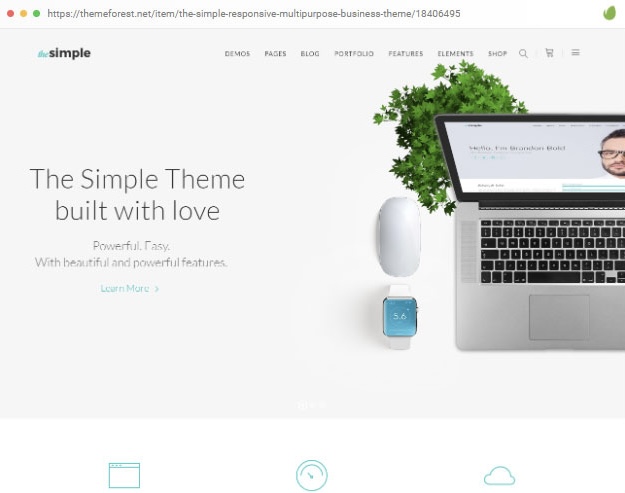
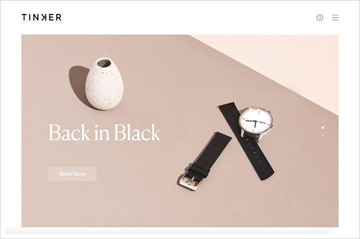
In minimalism design for apps and websites, both UI (User Interface) design and UX (User Experience) design play crucial roles. UI Design focuses on the visual elements and presentation of the interface. In minimalism, UI design emphasizes simplicity and clarity. This involves clean layouts, limited color schemes, simple typography, and flat design elements. The goal is to create an uncluttered, visually appealing interface that allows users to navigate effortlessly and focus on essential content or features.
UX Design concentrates on the overall user experience. In minimalistic design, UX design aims to streamline interactions and prioritize functionality. It involves intuitive navigation, ensuring that users can easily find what they need without unnecessary distractions. User flow is essential, and UX designers work to make the journey through the app or website smooth and enjoyable, eliminating any friction points that might hinder the user’s experience. Both UI and UX design in minimalism focus on reducing complexity, enhancing usability, and presenting a seamless, distraction-free experience for users, ultimately aiming to provide an interface that is intuitive, functional, and visually appealing.
Night Mode – Dark Mode
Let’s explore specific features that are noteworthy in app designs. Although it might occur that we may assume certain app features exist without purpose, it’s crucial to understand their rationale and impact.
For example, the integration of dark mode and night mode aligns perfectly with the principles of minimalism, providing users with alternative interface options that prioritize simplicity and enhance well-being. These are just one of those things that didn’t seem necessary until the option became known or until you had the opportunity to experience them firsthand.
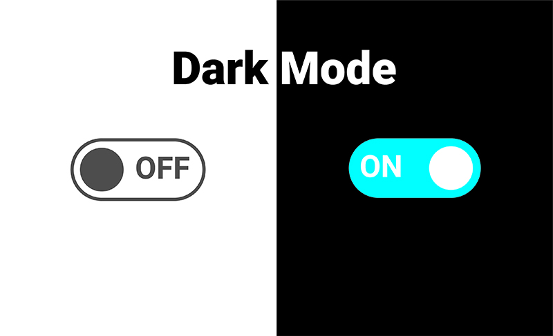
Dark Mode: This design option features a darker color scheme, often with dark backgrounds and lighter text or elements. Dark mode reduces eye strain, especially in low-light environments, and can enhance the visual experience by minimizing the emission of bright light from screens. It aligns with minimalism by offering a clean and subdued interface, focusing on essential elements and reducing unnecessary visual clutter.
Night Mode: Similar to dark mode, night mode adjusts the color scheme to suit low-light or nighttime settings. It typically involves softer, warmer tones to reduce the harshness of bright screens in dim environments. Night mode aligns with minimalism by simplifying the interface, making it easier for users to engage with essential content without distractions, all while reducing eye fatigue during nighttime use.
Both dark mode and night mode are features available in many modern apps, websites, and operating systems. Facebook, Google, Snapchat, and Instagram all have implemented this feature in their design interface.


Facebook introduced a dark mode feature, allowing users to switch to a darker color scheme that is easier on the eyes, reducing strain, especially during night time browsing.
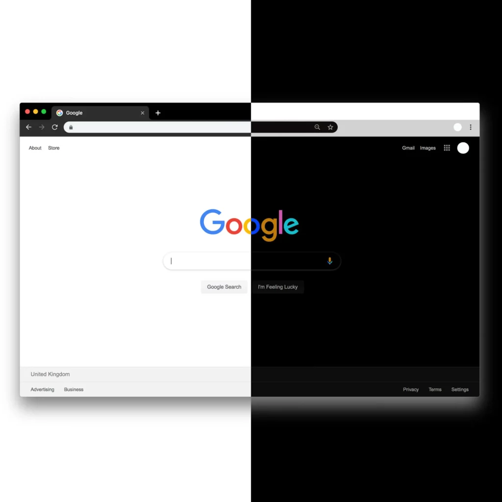
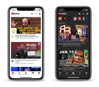
A variety of Google services and apps, such as YouTube, Chrome, and Android, offer a dark mode feature. This feature modifies the interface to darker tones, providing users with an alternative color scheme that’s more comfortable for low-light conditions.
Snapchat also implemented a dark mode feature, enabling users to switch to a darker color palette for reduced eye strain, especially when using the app in low-light environments or at night.
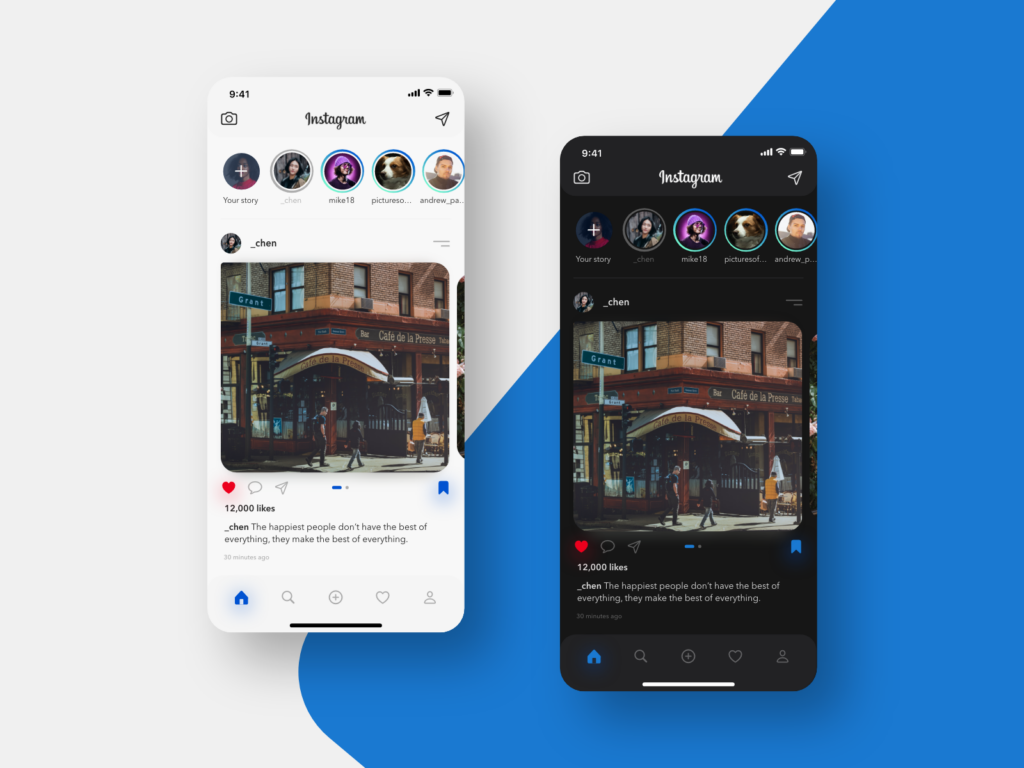
Instagram introduced a dark mode feature that alters the interface’s color scheme to darker tones. This alternative mode aims to improve user experience by reducing the glare and making the platform more visually comfortable, especially during nighttime usage.
Each platform’s implementation of night mode or dark mode aligns with the trend towards providing users with choices for a more comfortable viewing experience, emphasizing minimalistic design principles while prioritizing user comfort and reducing eye fatigue.
The integration of dark mode, night mode, and minimalistic design in web interfaces aims to offer users a choice for a visually comfortable experience while maintaining a clean, uncluttered interface that emphasizes essential content and functionality.
Health Benefits of Night Mode
The design features on our phones offer more health benefits than we might realize. There’s an entire science and knowledge aimed at safeguarding our eyesight safety and the quality of sleep your body gets at night.

Immoderate artificial light can negatively affect vision and eye health in several ways. Prolonged exposure to bright artificial light, especially blue light emitted by screens, can lead to eye strain, dryness, and discomfort. This prolonged exposure may also contribute to digital eye strain or computer vision syndrome, characterized by symptoms like headaches, blurred vision, and difficulty focusing. Too much artificial light, especially before bedtime, can disrupt the body’s natural sleep-wake cycle, impacting the quality of sleep and overall eye health.

Nighttime exposure to excessive artificial light, particularly blue light emitted by screens, can disrupt the body’s natural sleep-wake cycle, known as the circadian rhythm. This disruption can interfere with the production of the hormone melatonin, which regulates sleep. Using devices with bright screens before bedtime can suppress melatonin production, making it harder to fall asleep.
In contrast, reducing exposure to bright screens during the night, especially through features like night mode or dark mode that reduce the emission of blue light, can be beneficial for eye health. By minimizing exposure to excessive light, especially blue light, during nighttime use, these modes may help reduce eye strain and contribute to better sleep quality by supporting the body’s natural circadian rhythm. This, in turn, can positively impact overall eye health and contribute to a more restful sleep.
How are your current app settings—do you prefer light or dark mode? Have you enabled a nighttime mode for when you browse your phone at night? If not, would you consider doing so for the sake of better sleep quality and eye health?