App Store Screenshots: Conversion Patterns by Onboarding Style
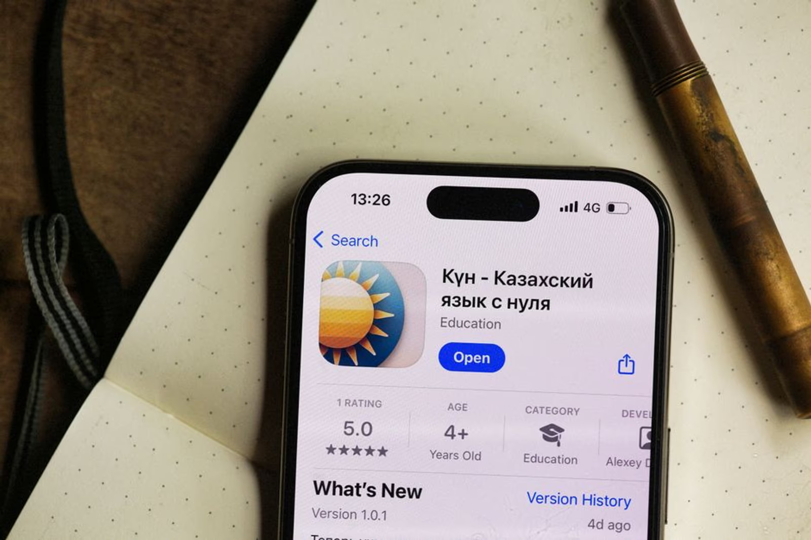
Most teams treat app store screenshots as a design task. Pick five frames from the app, add a caption, call it done. That approach consistently leaves conversion rate on the table — and the reason isn't usually bad design. It's a mismatch between the screenshot sequence and the way that app's users actually make install decisions.
App store conversion optimization isn't about making screenshots look good. It's about matching the screenshot narrative to the user's mental model before they hit install.
This post maps out three dominant screenshot sequences — feature-first, benefit-first, and social-proof-led — and the onboarding styles they pair with most effectively. No fabricated lift percentages, but patterns we see consistently across the apps we ship and optimize at Semnexus.
Why Sequence Matters More Than Individual Frames
Apple and Google both show the first two or three screenshots in search results before a user taps through to the full listing. That truncated view is doing the majority of conversion work. Users who tap through to see all screenshots have already made a tentative "yes" — you're just confirming it. Users who bounce at the search result never saw your best stuff.
That means screenshot one and screenshot two carry disproportionate weight. Whatever story you're telling has to be legible, compelling, and appropriate for a person who has never heard of your app — in roughly two frames.
The complication: what "compelling" means depends on why the user is searching in the first place, and what kind of commitment your app is asking for. A meditation app asking for daily 10-minute sessions is selling a different contract than a two-sided marketplace app where the value only appears once enough network effects kick in. Same screenshot strategy won't work for both.
The Three Core Sequences
1. Benefit-First
Lead with the outcome, not the feature.
Screenshot one states the core user benefit in plain language — typically a short headline overlaid on a lifestyle or results-oriented visual. Screenshot two shows the primary UI that delivers that benefit. Screenshots three through five walk through supporting features.
This sequence works when:
- The app's value is immediately understandable to a cold audience
- The app category is crowded and benefit differentiation is the primary wedge
- The target user is benefit-aware but tool-agnostic (they know they want to track calories; they don't care how)
Where it underperforms: When the product's value is genuinely novel or complex. If screenshot one says "Manage your fleet in real time" but the user doesn't immediately connect that to their workflow, the benefit statement lands as empty marketing copy. This is a common failure mode for B2B SaaS apps and logistics tools — the apps we built for Truck'N and My Home Delivery both required careful framing before the benefit statement read as credible rather than generic.
2. Feature-First
Lead with the interface. Let the product sell itself.
Screenshot one shows the primary screen of the app with real data populated — not a sterile UI with placeholder text. Screenshot two shows the second most-used feature. Benefits appear as short supporting copy rather than as the visual headline.
This sequence works when:
- The UI itself is a strong differentiator (unusual interaction pattern, genuinely beautiful design)
- The user is actively comparing tools and evaluating capability, not just awareness
- The category has sophisticated users who can read an interface and project value
Where it underperforms: Consumer apps targeting users who aren't power-tool buyers. If your user is a first-time fitness tracker who has never used this category before, a dense feature UI in screenshot one is intimidating rather than reassuring. Benefit-first or social-proof-led will typically outperform.
3. Social-Proof-Led
Lead with trust signals, then show the product.
Screenshot one leads with a review quote, a rating badge, a user count, or a press mention. Screenshots two through four walk through the core product experience. This approach borrows trust before asking the user to evaluate anything.
This sequence works when:
- The app has genuinely strong social proof (4.7+ rating with meaningful review volume, notable press mention, celebrity or influencer endorsement)
- The category has high perceived risk — healthcare, finance, anything touching personal data
- The user is skeptical by default, not enthusiastic
Where it underperforms: When the social proof is weak or generic. "Loved by thousands" without a number, or a 4.1-star rating with 60 reviews, reads as defensive rather than authoritative. Leading with mediocre social proof signals that you know the product won't sell itself. In that case, benefit-first will typically outperform until you've built legitimate review volume.
Matching Sequence to Onboarding Style
The screenshot sequence sets an expectation. The onboarding flow either confirms it or breaks it. That break — the mismatch between what the store listing promised and what happens after install — is one of the most common drivers of early churn in apps we audit.
| Onboarding Style | What It Signals | Best-Fit Screenshot Sequence | Common Mismatch to Avoid |
|---|---|---|---|
| Value-first (core feature accessible before account creation) | Low commitment ask, fast gratification | Benefit-first | Don't lead with social proof if you're going to wall off the product behind a paywall on frame one of onboarding |
| Progressive disclosure (feature layers revealed over sessions) | Complex product, rewards patience | Feature-first (but show early wins, not advanced features) | Don't show power-user screens in screenshots that new users won't see for weeks |
| Social onboarding (value depends on finding your network) | Network-effect product | Social-proof-led | Don't show a populated social feed in screenshots if new users land in an empty one |
| Tutorial-required (guided walkthrough before free use) | High learning curve | Benefit-first (abstract the complexity) | Don't show the tutorial UI in screenshots — it signals friction, not value |
| Immediate personalization (quiz or intake before anything else) | Tailored experience | Benefit-first with outcome visuals | Don't show personalization UI — show the end state it produces |
The most durable insight from this table: what you show in screenshots should match the user's first five minutes in the app, not the app's most impressive feature at month three.
Platform Differences Worth Knowing
Apple App Store and Google Play have different display behaviors that affect sequence decisions.
On the App Store, portrait screenshots display three at a time in search results before the user taps through. Landscape (16:9) screenshots display as a single frame. This means portrait orientation is generally stronger for consumer apps where the browse context matters — you're telling a story across three visible frames. Landscape makes sense when a single, wide UI frame is the most compelling visual you have.
On Google Play, the first screenshot is often accompanied by the feature graphic (the banner image at the top of the listing). The feature graphic and screenshot one need to work as a coordinated pair, not independently. Many teams design them separately and end up with a redundant or contradictory message at the top of their Play listing.
Both platforms now support short preview videos. In our engagements, preview videos tend to help most in categories where motion is core to the product experience — games, fitness, anything with animations that screenshots can't convey. For utility apps and B2B tools, a strong static screenshot sequence typically outperforms a mediocre video, and a mediocre video can actively hurt conversion by auto-playing in a way that makes the listing feel chaotic.
Working on your app's store presence? Our mobile app marketing services cover ASO end to end — screenshot strategy, keyword optimization, conversion testing, and ongoing performance tracking.
What to Test (And in What Order)
Most teams have limited testing budget. If you can only run one experiment at a time, prioritize in this order:
- Screenshot one headline copy — the single highest-leverage variable. Test benefit statement vs. social proof hook before you redesign anything visually.
- Screenshot two subject — once frame one is locked, test whether frame two should show core UI, a secondary benefit, or a trust signal.
- Caption style — short imperative ("Track every rep") vs. outcome statement ("Athletes who trained consistently lost X% more fat") vs. feature label ("Built-in nutrition database with 2M+ foods").
- Sequence reorder — once individual frames are strong, test the full sequence rearrangement.
Don't test the visual design of individual frames until you've validated the narrative structure. Redesigning a screenshot that's positioned wrong is wasted effort.
For a broader view of how to frame and present optimization results to stakeholders, the breakdown in 5 Metrics You Can Use to Persuade Your Clients SEO Tactics Really Work translates reasonably well to ASO — conversion rate, install volume, and search impression share tell a clear story without requiring you to claim causation you can't prove.
FAQ
Does the same screenshot sequence work on both the App Store and Google Play?
Not always. The display differences — portrait vs. landscape behavior, the Play feature graphic, how many frames show in search results — mean your sequences may need to be adapted per platform rather than simply resized. A sequence optimized for App Store portrait layout may not translate directly to Play without rethinking frame order.
How often should we refresh screenshots?
Approximately every six months, or after any major feature release that changes the core value proposition. Don't refresh on a calendar schedule — refresh when something meaningful has changed in the product, the competitive set, or your understanding of what users respond to.
Can social proof screenshots work for a new app with limited reviews?
Rarely. If you have fewer than 500 reviews or a rating below 4.4, leading with social proof typically reads as weak. Build review volume first through in-app rating prompts at high-satisfaction moments, then introduce social-proof-led sequences once the numbers are defensible.
Should screenshot copy be localized?
Yes, if you're targeting non-English markets meaningfully. Copy that's not localized signals to users in those markets that they're an afterthought — which typically suppresses conversion more than the translation effort costs. App localization also factors into App Store ranking signals for regional searches.
What's the right number of screenshots?
The App Store allows up to 10; Google Play allows up to 8. In practice, most well-converting listings use five to seven. After frame five, you're typically talking to users who are already decided — frames six through ten can reinforce but rarely convert. Don't pad the count with weak frames; a tight five outperforms a sprawling ten.
Does a preview video replace screenshots or supplement them?
It supplements. Stores still show screenshots in search results — the video only plays when a user is actively on the listing page. Treat the video as a deeper-funnel conversion tool for users who are already interested, not as a replacement for the screenshot sequence that earns that interest in the first place.
Related Reading
If you're thinking about deep linking as part of your post-install experience, that post covers how deep link strategy connects to the promises your store listing makes — another dimension of the install-to-activation alignment problem this post describes.
Screenshot strategy is one of those ASO levers that gets underfunded because it doesn't feel like "real" marketing. It's not code, it's not ad spend, it's not a channel. But it's sitting at the exact moment when a user decides whether to install — and most apps treat that moment as an afterthought.
If you're shipping a new app or auditing an existing one and want a team that's done this across healthcare, marketplace, logistics, and consumer categories, talk to us. Our mobile app marketing services include screenshot audit and conversion strategy as part of every ASO engagement. Or book a 30-minute call and we'll tell you where your listing is leaving installs on the table.