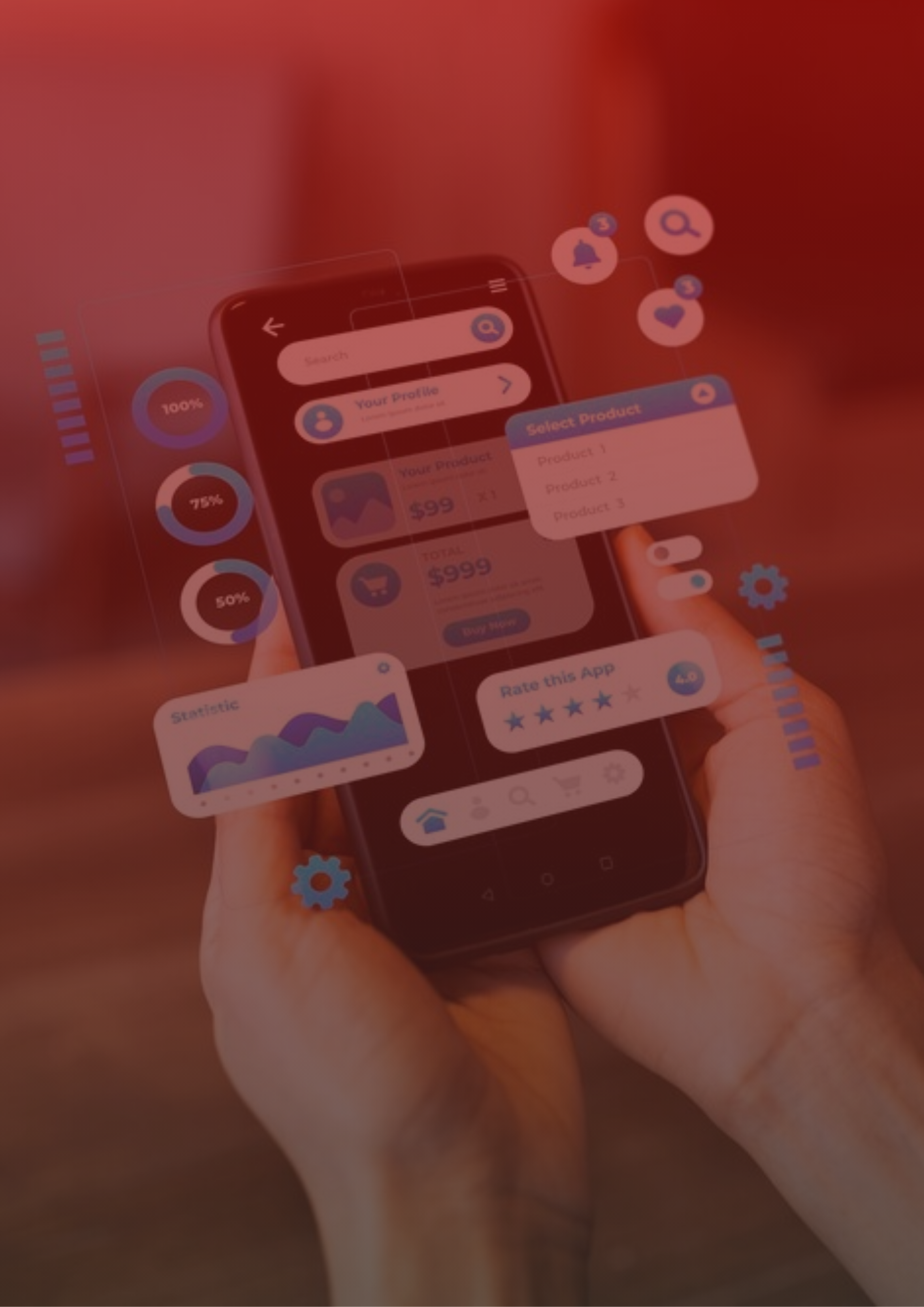
Pop-ups are often blamed for bad user experiences. And let’s be honest—they deserve it.
Too many apps deploy intrusive, poorly timed modals that interrupt the flow, ask for too much too soon, and ultimately push users away. But the real issue isn’t the pop-up itself—it’s how it’s being used.
At SEM Nexus, we’ve found that when modals are rooted in user behavior, tied to meaningful moments, and deployed with surgical precision, they don’t just avoid friction—they actually accelerate conversion.
This article explores three types of in-app pop-ups that consistently perform, even with skeptical users. Each one is designed to align with how users think, feel, and behave—not how marketers wish they would.
The “Micro-Win” Monetization Moment
Conversion doesn’t happen when you want it to. It happens when the user feels they’ve experienced something valuable—something worth protecting, extending, or upgrading.
This is where most upgrade prompts fail: they appear before the user feels anything at all.
Instead, trigger your upgrade prompt after a “micro-win”—a moment of emotional or practical payoff.
Examples:
A meditation app prompts upgrade after completing a first full session and unlocking a “streak” badge.
A language learning app offers premium grammar tools after a user finishes their first lesson with a high score.
A workout app displays an upgrade after completing a personalized routine based on initial user input.

Why it works: It taps into the Endowment Effect—users are more likely to pay to keep something they feel ownership over.
Pro Tip: Use a tool like RevenueCat to create logic-based upgrade flows tied to specific user events, rather than generic time-based prompts.
The Emotionally Timed Review Request
Asking for ratings is crucial to visibility and credibility, but bad timing turns review prompts into a UX hazard.
When a user is focused, confused, or frustrated, any interruption—especially a “Rate us!” modal—will backfire.
Great apps wait until the emotional high point of a session, then ask.
Examples of good timing:
After a user completes a multi-step task
After receiving helpful recommendations
After resolving a pain point (e.g., budget insight, language translation, order tracking)
Why it works: According to Apple’s Human Interface Guidelines, contextual review prompts see significantly higher response rates and better ratings—because users are emotionally aligned with your ask.
Use native iOS/Android review APIs or platforms like AppFollow to schedule reviews based on engagement signals, not time alone.
The Value-Driven Permission Prompt
This is one of the most mishandled pop-ups in mobile UX.
Most apps immediately ask for permissions—notifications, location, camera—without giving the user any reason to say yes. This erodes trust and undermines onboarding.
Instead, use pre-permission modals that explain why the app is requesting access, and only ask when the user reaches a relevant task.
For example:
Don’t ask for push notification access on first open. Wait until the user schedules something, completes a milestone, or interacts multiple times without returning.
Don’t request location access until the user searches for something “near me” or requests a map view.
Don’t ask for camera/microphone access until the user initiates a feature that clearly requires it.

The Emotionally Timed Review Request
Asking for ratings is crucial to visibility and credibility, but bad timing turns review prompts into a UX hazard.
When a user is focused, confused, or frustrated, any interruption—especially a “Rate us!” modal—will backfire.
Great apps wait until the emotional high point of a session, then ask.
Examples of good timing:
After a user completes a multi-step task
After receiving helpful recommendations
After resolving a pain point (e.g., budget insight, language translation, order tracking)

Why it works: According to Apple’s Human Interface Guidelines, contextual review prompts see significantly higher response rates and better ratings—because users are emotionally aligned with your ask.
Use native iOS/Android review APIs or platforms like AppFollow to schedule reviews based on engagement signals, not time alone.
Don’t Avoid Pop-Ups—Just Rethink Them
The truth is, users don’t hate pop-ups.
They hate friction, interruption, and being asked before they’re ready.
If your pop-ups are built around:
Value moments (not splash screens),
Clear user psychology (not guesswork),
and thoughtful timing (not automation defaults),
They won’t just be tolerated—they’ll be welcomed. They’ll feel like helpful nudges, not marketing traps.
Final Thought
In a mobile landscape crowded with noise, the apps that grow in 2025 aren’t the ones shouting the loudest—they’re the ones that speak to users when it matters most.
At SEM Nexus, we help apps design behavior-driven user journeys that turn moments into momentum—whether it’s activating a new user, earning a 5-star review, or closing a subscription.
Let’s make your next pop-up the one that actually works.
Visit semnexus.com to get started.